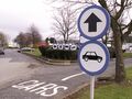
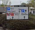
Sending you in circles

One of the most common comments we receive from people who are interested in the industry relates to the way service stations manage their traffic flow.
The problem is that managing traffic, especially the very high volumes of traffic you can find at a service station, is a highly specialised skill that is in short supply. Service stations are retailers with interests such as corporate branding, selling food and saving money. With the best will in the world, no retailer is going to be an expert in managing traffic, that's simply not their specialism.
Service stations will work with third parties to receive advice on the subject, but that doesn't guarantee it will be good advice. As a result you can end up with some pretty crazy road layouts that have often been designed to address the problem with the previous road layout.
The Rules and The Problem

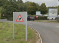
Motorway service areas are all built on privately managed land, and are therefore responsible for creating and maintaining their own road layouts, filling their own pot holes and, worryingly, creating and maintaining their own road signs.
Since 1994, the service area regulations have been absolutely clear that all service station road signs must comply with the Traffic Signs Regulations and General Directions (TSRGD). The TSRGD tells you exactly what each road sign must look like, down to excruciating details like fonts and stroke widths.
The TSRGD is written for professionals and designed for public roads. It doesn't consider things like a drive thru. To get around that, the service area regulations also stated that the Highways Agency (which was retired in 2015) can assess and approve any bespoke road signage that is required.
The Highways Agency made plenty of their own errors with road signs, but they were still a good authority on the subject. Their successor, National Highways, was not supposed to be authorising new traffic signs, but for complicated reasons that's not the issue. What is an issue is that, when we contacted National Highways for advice in 2021, their spokesperson did not seem to know what the TSRGD was. One correspondent tells us that, when they were involved, approval for service area road signs came from a department that was not normally involved with creating road signs. National Highways say they have a designated "signage specialist" (their phrasing) for this task, and we will have to assume they were well-versed on the subject, even though this background didn't provide much confidence.
The regulations were corrected in 2022 to replace the reference to the defunct Highways Agency with the Department for Transport. They now say that only in "exceptional circumstances" will non-standard signs be appropriate. This creates a new problem: the Department for Transport is a big organisation used to dealing with major projects, and it's not clear if they have the resources to closely examine car park signage schemes.
Enforcement
Whenever a new service area is proposed or an existing one is expanded, the highway authority (which would be National Highways if we're dealing with an English motorway) will examine the plans to see if the planned road layout can safely accommodate the expected traffic flow. The highway authority's concern is that a badly-designed development could cause a queue to back out onto the main road, which can't be allowed to happen.
This process rarely examines the quality of the road signs, other than assuming that clear road signs will be in place. Even when the signs are checked, there is no guarantee that they will be checked by somebody interested in the subject.
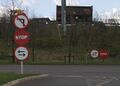
Once the service area has been built, there will be no further checks on its road layout or its road signs. Changes will be made however the operator sees fit. If any issues do arise, the highway authority and police may work with them to solve them, but it's very unlikely that there would be any heavy-handed enforcement over something as minor as a direction sign - it's simply not worth anybody's time.
Emergency Access Issues
At the oldest motorway service areas, there is a rear access provided for use by staff, the emergency services, hotel guests and, these days, food couriers. Using this usually involves going against the flow of the rest of the traffic, which means extreme care must be taken by anybody designing these.
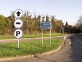
Most service areas will do this by making their circulatory roads two-way. Very clear signage and markings are needed because people leaving a service area tend to assume it's a one-way road, plus there's the added danger that somebody going 'against the flow' could end up trying to join the motorway in the wrong direction. The best practice would be to create a segregated route for people who need to go the 'wrong way', which often isn't possible in the space available, and where it can be squeezed in there is a chance that you will end up with a confusing route that criss-crosses car parks.
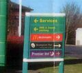
Branded Road Sign History

Between 1959 and 1992, motorway service areas were kept under a close eye by the government, who owned the land they were built on.
The first signs were made by the Ministry of Transport, based on the motorway signs which they were also responsible for. Operators were soon allowed to make their own signs, but the government insisted that they use the correct colours and symbols and that they arranged the symbols horizontally where possible. The Ministry were surprisingly relaxed about the choice of font, but aside from that, these signs were a good effort and most people wouldn't notice the difference.
Attitudes began to change as deregulation set in during the 1980s. When Welcome Break was relaunched in 1988, they covered up their signs with their new house styling: they and Granada both used a blue that was adjusted to match their own house style, with an emblem on top. Pavilion followed in 1992 by making all their signs a low-contrast gold-on-green, matching their new colour scheme. But things were totally sober compared with what was about to come.
The 1994 regulations made it clear that road signs must comply with the TSRGD. There was some confusion over whether this should apply to existing service areas, but enough time has passed now that it would reasonable to say they should have caught up with it. Of the service areas which have opened after the 1994 rules, about half ignored the TSRGD. But mostly it's when replacing existing signs that operators insist that the rule doesn't apply to them, with one operator telling us it's not a problem because, "it's our land".
Pedestrian signage has never been covered by the regulations, except that the directions for pedestrians should be clear and consistent. This is because they wanted operators to have the artistic freedom to match whatever vibe they were trying to create with their buildings.
Moto
Moto are perhaps the most famous revolutionary, and are usually the operator that road sign fans name first.
It started in 1996 with Moto's predecessor, Granada. Until 1996 Granada's road signs were mostly standard motorway signs, but with the old Pavilion sites still using green.
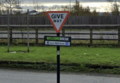
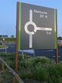
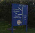
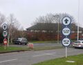
Granada hired a consultancy called Pentagram to thoroughly overhaul their brand image. Pentagram decided that the 'new Granada' should be all about circles. Circles are neat, they are smooth, and when you have one on the end of a stripey pole it looks like a children's sweet and that's exciting. A publicity piece claimed the signs would "help people feel good", and boasted that the symbols were instantly recognisable.
Their work included creating a new set of road signs which, following approval from every local planning authority and (apparently) Thames Valley Police, saw almost all of their existing road signs taken out and replaced with circles. Instructions, warnings and A-roads got a red circle, other directions got a hollow blue circle, and signs for pedestrians got a solid blue circle. Signs that would normally have triangles instead got circles.
In fairness to Granada it was a quick yet extremely thorough rebrand and the consistent use of circles and curvy poles did look quite stylish in an almost-continental way. Even more continental-looking was the fact that some of their signs were always drawn to wrongly instruct traffic to use the right-hand side of the road. That was an incredibly basic and dangerous error.
-
 Welcome to Granadaland: Granada did things their own way.
 -
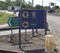
 While at first their circles seemed simple, they were often used in confusing ways.
 -
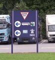
 Two signs telling you to drive on the right, two stop signs that are the wrong shape, and a give way.
 -
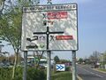
 An old Pavilion sign stands next to the new Granada (giving different directions, obviously).
 -
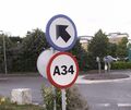 A-roads were given red circles, which didn't make a lot of sense but did look like it was banning you from the A34.
 -
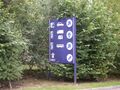
 The system was used for pedestrians and animals too.
 -
 Another road sign with too much text for a tiny circle.
 -
 Even basic legal signs in the garden made sure they used a circle.
 -
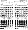 An exclusive from us: the full list of Granada road signs.


_signs.jpg)


The Pentagram signage was famously mocked by Roads.org.uk in one of their most popular features. While their perspective was deliberately pedantic, the fact remained that Granada had gone to a great deal of effort to create signs that were less helpful than what already existed. Granada's work was so notorious that, before the regulations were rewritten in 2008, the Highways Agency cited "one operator's use of circles" as their reason for clarifying the rule on internal signage.
The circles themselves weren't really the main issue here. It's that the whole idea of separating the arrow from the symbols went against the basic principles of wayfinding. You had to read more of the sign to get the message, because it wasn't immediately obvious where to look.
Not only was this signage system rolled out thoroughly, it also has an incredible ability to cling on. As of 2024 there are still examples of it all over the country, and some show no sign of going anywhere any time soon.
New Moto
After Granada became Moto in 2001, Moto followed the principles of the Pentagram signage, but there wasn't really a system. One change for traffic was that turquoise-coloured speed limits and transient bars were painted across their roads, to create entrance gateways.
The stylish Pentagram signs were of an awkward shape that was easily damaged and difficult to replace. Moto had to work with new suppliers and tried to address some of the complaints while still honouring their loyalty to circles. At some locations, the circular arrows clearly weren't working and they reverted to text, at others they tried to use standard arrows wrongly, and at Winchester they kept the previous operator's signs. The system's saving grace - that it was consistent - was lost.
-
 The style of the signs meant they were easily damaged.
 -
 New signs were ordered for Washington in 2009, far smaller than the old sign behind it.
 -
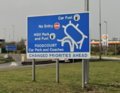
 In 2014, Moto replaced some of their car park directions with adverts. This isn't helpful.
 -
 At Wetherby, new (and very tired) signs tell motorists they must go straight and turn right, with worded signs to explain.
 -
 At Bridgwater, a new road layout (2015) meant new signs were needed. Red circles were an odd choice.


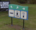
Moto relaunched their brand in 2021. Working with BrandOpus, a new corporate style was created that incorporates a 'yellow smile' motif into everything they do, including the indoor and outdoor signage.
This means Moto are rolling out a new set of road signs. They are functionally similar to the existing set, but use white symbols on dark green circles, with a light green backing board. The yellow motif is then incorporated into every symbol.
At least complicated situations will now get written messages; these will use the same colours and have Moto's logo across the top, lest you forget where you are. The system was able to be used at the newly-opened Rugby, perhaps because safety critical signage now conforms to the TSRGD, even if the directions don't.
-
 Moto's new house style shows that they are still in no rush to conform.
 -
 All smiles in the car park.
 -
 The message on the new sign is lost amid all the clutter. The 1980s council sign on the right still does a clearer job.


Just like Granada, Moto's new signs are very good at showcasing their branding. As actual signs, they seem unnecessarily complicated, especially with the inverted colours that look like the Highway Code has been put into dark mode. The cute and stylish symbols are less clear than the standard ones (especially their bus symbol which, to fit their circle, looks more like a van); in fact the symbols are smaller than what they have replaced, with less contrast.
The clear fonts are a big improvement, and it is good that they have finally moved on from the perils of inappropriate red circles, especially when it comes to the safety-critical signs. Taking down all the branded circles is not a bad idea either. Overall though, it was a missed opportunity to address a few more issues, and they are still making simple directions unnecessarily complicated.
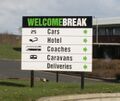
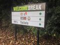
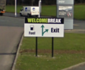
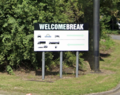
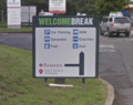
Welcome Break
The 1988 Welcome Break logo had a dark blue colour with a diagonal line running across the top of it. As explained above, this was applied to their road signs too, with every symbol appearing inside a blue box with that shape, regardless of whatever shape the sign was actually supposed to be. Directions were given in small lines of text, with an arrow on each line.
Like with Granada, if their aim was to be unique then they succeeded, but being unique doesn't help people get around safely. Welcome Break were never as thorough as Granada, and some 1970s signs remained well into the 2000s; there are still a few at Hartshead Moor.
Their branding was overhauled in 1998. The new logo had lighter colours and more of a swish along the top, and the signs were updated to match.
Weirdly, each direction sign would now be arranged horizontally, with a series of square symbols side-by-side, and a green bar across the top with an arrow to go with each symbol. They used black-on-white symbols with text below, in a yellow box, which was then inside a blue box. The same colours were used for signs inside the building, like those showing male and female toilets.
-
 The '90s Welcome Break signs, with tiny direction text.
 -
 Using all the colours: Welcome Break's 1998 edition.
 -
 Three in a row, and we're going horizontal.


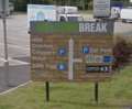
Welcome Break were subject to a more radical brand refresh in 2006. This was carried out by Fitch, and was all about "standing out", using bold colours and large fonts.
From a traffic point-of-view, warning signs would now be placed inside simple, large, green rectangles, which were designed to cover up the old shapes, usually with a caption added, like "caution". Messages would be written in green capitals. Direction signs would have the new Welcome Break logo along the top, with each direction written on its own line, with a very small, green arrow next to each one.
As well as all the text and all the reading, the other issues with this style was that they would often fill empty space by displaying their brands' logos. These would then need to be updated as franchises changed and inevitably some signs were forgotten.
-
 The 2006 signage, with its tiny arrows.
 -
 Brand logos were used in some places, which were soon out of date.
 -
 The 2006 branding when applied to some regulatory signs.


Welcome Break must have realised there were issues, because in around 2009 many (but far from all) of these signs were replaced, and what followed was a period with very little consistency. Many sites gained new signs with clear text and arrows that managed to be both on-brand and high-contrast; the only niggle was that their use of duplicated arrows wasn't ideal.
Other sites gained map signs, and a few other ideas. At most junctions, the 2006 signs remained.
-
 The main sign style used from 2009, with clear text and arrows.
 -
 Some sites got this map sign, with clear arrows, which sadly faded very fast.
 -
 Much clearer arrows were trialled in 2009, but still with poor contrast.
 -
 Sarn Park had all its signs put in this very strange style in 2016, with a distracting background.


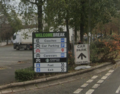
The Sarn Park idea turned out to be the inspiration for even more changes, made in around 2017. Mercifully, the low-contrast, patterned background was removed, and the resulting sign was reasonably close to a real road sign, albeit still a bit cluttered.
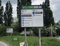
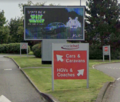
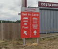
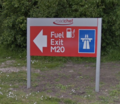
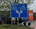
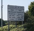
That was only used at a few junctions. In most cases, another new 'ladder' sign was used, with duplicated arrows and a lot of different colours. It is usually placed at the entrance to the service area, and carries a lot of information on what is often a very small sign.
The other preferred sign is even stranger. It is a take on the "GET IN LANE" signs that are used on the public roads, showing you which lane to use, but it doesn't have any arrows or instructions to tell you that this is what it's saying. This is just about acceptable when it's placed on a two-lane road, but sometimes they place it after one splits, in which case it's not even the right sign for the situation.
-
 Most signs are now in this ladder style, with many arrows and a lot of colour. The presence of another sign tells you it isn't working.
 -
 An absolutely tiny direction sign where the branding is quite distracting. At least the warning sign is right.
 -
 A plausible copy of a road sign is now used in some places, albeit still cluttered.
 -
 The preferred sign for roads with two lanes, with nothing to tell you what it means (compared with council sign in the background).
 -
 One sign installed in 2018 gives hope that somebody has read the TSRGD. It's correct!
 -
 Rotherham launched in 2025 with another new sign design; this one a reasonable copy of real signs.


New safety-critical signs are now not carrying any branding at all, which is a very responsible move.
Welcome Break have clearly gone through a lot of different ideas during the 2010s, some better than others. Arguably the current set isn't their best work.
Roadchef
Roadchef's 1990s system is the more forgotten of the three, perhaps because it was less distinctive.
All of their signs were dark blue, possibly created by Pentangle Interiors in 1997.
Warning signs were kept as standard, but placed in a dark blue box. Direction would normally be given by a map sign, with symbols for each item, although for more simple areas they did have text signs with large arrows facing the correct side. They even flipped the symbols to face the correct direction, as suggested in the TSRGD, which is an impressive detail to get right.
Site exits were normally signed with a large motorway symbol. Arguably there was too much repeated information, but the symbol did at least show some originality.
-
 Roadchef's main signage style adopted in the 1990s. It's far from perfect, but we've seen worse.
 -
 Too much unnecessary information here means the important message ("Give Way") has been lost.
 -
 More excessive detail can be found at site exits, but at least it's clear.
 -
 Map signs were used to help with complicated areas, with little success.
 -
 This is a horrendous choice of font that is impossible to read from a moving vehicle.


Roadchef certainly had their issues, though. One sign at Stafford pictured above - perhaps a leftover of an earlier system - used a cursive font that was shockingly difficult to read. Signs on the A43 kept calling it the "A43(T)", and a strange solid red symbol was used to show banned turns.
They also seemed relaxed about consistency: about half of their sites kept their 1980s standard signs. Norton Canes (built 2004) correctly used fully compliant white signs but Winchester (2001) didn't. Some map signs had arrows and symbols, others didn't. At Sandbach, they had some incredibly small, red, direction signs - possibly another system that had been used.
Watford Gap had all of Blue Boar's signs replaced but Annandale Water still has them. This means we can see that Blue Boar used dark colours with the company logo and a list of directions, with an arrow on the left of each one and a very small symbol on the right. These are now being replaced like-for-like, maintaining outdated references like "DERV" and "A74". At Magor, Roadchef stuck their name over the top of the previous operator's standard blue signs, and even created new signs in that same style.
-
 One of many 'vintage' signs which were still in use as of 2023.
 -
 An example of Blue Boar's signage, still giving directions at Annandale.
 -
 Yet another different system, and one that was very hard to read.
 -
 At Magor (2011), they copied the previous operator's compliant style. Poor use of symbols, though.


Two new sets of signage were created in around 2018. Northampton had its blue signs replaced with white signs that were extremely similar, with large arrows, large symbols and clear text. Many other sites have adopted a different style which has a bright red background. That's just their company colour, but it's very eye-catching.
These new signs have the company logo across the top, a grey border, and they show symbols and words, with arrows on the right-hand side. They can get overloaded at complicated sites, but at simple splits they are very clear. As the signage tends to get less cluttered once your only option is the exit, the overall conclusion is that while you might not be able to find your way in, you really shouldn't have any issue finding the way out.
-
 The white signs used at Northampton. The arrows could be better, but that's about it.
 -
 The red style of signs. A few minor changes and these would be very clear.
 -
 Choose a more simple junction, and the signage is excellent. Unfortunately Roadchef also like placing digital displays at junctions, which is a separate debate.
 -
 The 2018 style signage as you leave the motorway.
 -
 The 2018 style applied to Roadchef's old exit sign. The motorway symbol is an interesting idea.
 -
 This sign from 2019 looks like an attempt to provide a TSRGD complaint sign. Will there be more?


There is almost an argument that the white signs are better than their preferred red ones, because the red is so eye-catching it can take a little longer to process. Others may disagree.
Safety-critical signage is now provided as standard but inside a grey box, but there does seem to be a few examples of the wrong signs being used. These are simple mistakes that even real highway authorities frequently make, but it's still vital that silly mistakes are avoided.
-
 This sign tells you that there is a junction with a two-way road, but it's meant to say that you're on one.
 -
 This one is saying you must turn left, but you don't need to. Also those giant adverts make the road sign somewhat pointless.
 -
 The triangle shape shouldn't be used before the junction, but more importantly, that layout needs reviewing.
 -
 Again, the use of arrows needs reconsidering. It's not so bad in reality, but it does make you look twice.


Since 2014, Roadchef have picked up a habit of using large brand logos (effectively adverts) as direction signs. This isn't necessarily objectionable, but some of these sign-adverts have been very poorly positioned.
Extra
As all of Extra's service areas opened in the 21st century, they have no excuse for not trying to follow all the latest regulations at all their sites. And the phenomenal news is, they do!
They still have a few funny moments. They have a penchant for writing their name on everything, and they love to stick brand logos everywhere too.
Cobham has been trying to deal with very heavy traffic flows and as a result, every time you visit, the signs and the road layout seem to get more desperate. They have been known to get carried away elsewhere too: at Peterborough, they have tried to map the entire complex on a single direction sign, which is blatantly ridiculous and a bit dangerous.
But if you excuse those little quirks and remember what we've tackled so far, Extra certainly have the right idea.
-
 A mostly complaint sign, with a little bit of branding.
 -
 Some of their signs are so large they can be seen from far away.
 -
 Out of control at Cobham. The sign shows the wrong entry, and is too messy.


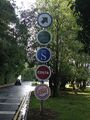
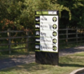
Extra also like to write important messages in a larger font, which is something so basic that the others tend to miss. For pedestrians, they tend to use village-style fingerposts, an unusual touch which adds a more quaint charm. At other sites, they use town centre-style blue signs for pedestrians: an attention to detail that goes above and beyond what was asked of them.
Westmorland
Westmorland has a reputation for doing things differently, and that applies to their signs too. They like to use wooden posts, with light text on a dark background. It suits their colour scheme and carries their 'at one with nature' theming.
Their corporate styling was updated by Squad in 2014, using the road sign font Transport New. The road signs weren't changed at the time, but followed a few years later.
Their signs now use clear text, a mixture of arrows and maps, and only a single arrow per direction, which makes their signs extremely easy to read. If you believe that road signs have to incorporate corporate branding, that seems to be a good way to do it.
-
 A typical Westmorland direction sign, with single arrows and clear text, though still not perfect.
 -
 The friendly style of signage, used all around Westmorland sites.
 -
 Some signage at the rear of their premier Tebay site in 2015, since replaced.


Gloucester (2014) was opened with a very good interpretation of the TSRGD's standard signage. The whole set was replaced in around 2019 with new signs in Westmorland's updated house style.
Others
Motorway service areas encounter all these issues because they are unusual places. They are large complexes with lots of different places that people could be heading for, but the whole complex is usually managed by one operator who are keen to apply their own touch.
This is why A-road service areas are normally a lot simpler. Sometimes they don't need any signs at all, because they are smaller and you can often see exactly where you need to go. Where they do need direction signs, these are normally provided by a landowner that nobody knows, or by a brand that doesn't really want to be associated with the whole complex, so standard signs are normally used.
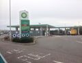
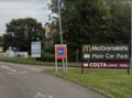
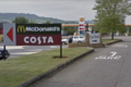
Companies such as fuel brands, hotel brands and drive thrus do all have their own internal signage schemes, but these are only applied to the area immediately around their premises. These are used at all of their sites across the country, and are usually required as part of any franchise operation. This includes motorway service areas, so BP-branded traffic signs will be used inside BP, and Starbucks signs will be used around a Starbucks drive thru.
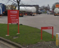
EG Group, who operate one motorway service area, have a house style of road signs reserved for their larger sites. It has the company name written across the top, and then each direction is written in a very clear font, with an individual arrow next to each item. Those arrows are in the company's light green colour, which offers a poor contrast on a white sign. At most of the rest of their sites, EG Group style each facility as its own stand-alone outlet, as described above.
-
 EG Group's house style, used only at larger sites.
 -
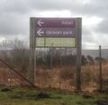
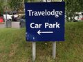 A Travelodge branded sign, a typical example of a branded sign for one facility only.
 -
 Little Chef occasionally had to signpost complicated sites, sometimes using this style.
 -
 A direction sign from within a BP forecourt.
 -
 A roundabout with two restaurants: an example of when brand logos can be helpful.


The last sign is an example of where brand logos can be useful. Here, the junction (which uses otherwise compliant signs) is giving directions to two different restaurants, so clarity is needed, even though the TSRGD doesn't actually allow it.
Northern Ireland doesn't have many service areas, and it is able to authorise its own road signs anyway, but the service areas it does have do stick closely to the TSRGD, right down to each car parking aisle being adorned with bog-standard 'no entry' and 'one way' signs.
Boundary Issues
Although motorway service areas are private land with a defined boundary, road safety doesn't respect such boundaries.
Many of the older service areas were built to much lower road safety standards and present the motorist with a junction as soon as they leave the motorway. These days motorists expect more warning and, thankfully, National Highways are understanding and do work with the operators to allow appropriate signage to be installed on their motorway.
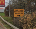
These signs must respect the regulations for road signs on motorways. National Highways are far from perfect in that respect. At Northampton, there is a bright yellow sign on the M1 which says "CAR PARK ENTRANCE 65 YARDS". National Highways should know that signs on that road are supposed to be coloured blue, written in mixed case, and use the internationally recognised car park symbol.
-
 Even the experts get it wrong: this should not be on a motorway, and it shouldn't be hidden by trees every summer.
 -
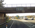 The backlit motorway sign giving directions around Trowell.


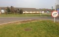
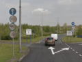
One of the strangest examples of co-operation was at Trowell (opened in 1967), where a backlit sign was attached to the motorway overbridge to tell lorries to keep left and cars to keep right. By the 2000s it was now so old it could barely be read. Presumably it only lasted so long because nobody could work out who was responsible for replacing it. In about 2010, during the major roadworks, that sign was finally taken down and replaced with a new one on the verge.
Co-operation can happen the other way round too. When a service area is positioned at a junction, the exit from the car park needs to give clear instructions on how to navigate that junction, even if that means placing the council's signs inside the service area. At some sites, the service area has tried to help out in their own house style, with less-than-ideal results.
-
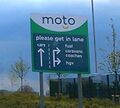
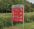
 Moto prepares you for a big roundabout, the only way they know how.
 -
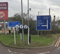
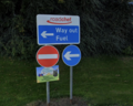
 A genuinely useful and (street lit!) road sign is covered up by a branded one that gets the road number wrong.
 -
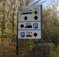
 This one from Extra tries to be official, and comes close, even if it is very needy.
 -
 A complaint road sign, on private land!


Correct Signage

Show Me A Sign, one of the most respected voices on the subject of road signage, is generally critical of private landowners who try to invent their own road signs. These companies will have their own reasons for doing that, but if road safety is your top priority, you won't be able to create a more successful system than just using the normal signs exactly as they appear in the Highway Code.
There is a commercial argument for taking this seriously. If the route in and out of your car park isn't immediately obvious - or it doesn't feel safe - drivers will make a mental note not to return. Businesses talk a lot about corporate colours in terms of 'brand identity', but a reputation for making drivers feel lost is not the 'brand identity' that any company wants.
Despite this, some businesses will insist that their desire for a visible corporate identity trumps anything else. It may be possible to incorporate this without causing any issues. Our tour of the existing examples has allowed us to establish some advice for those scenarios:
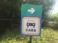
- Clear text is a must. It must contrast with the background, and be written in a simple font, with mixed or lower case. If you think people will miss it, make it larger.
- Symbols should be provided wherever possible for non-English speakers. They should be simple and obvious rather than artistic and cute. Relying solely on symbols is allowed, but not recommended.
- Arrows are better than map signs for a simple split, but map signs are better for complicated junctions. That said, you should try to avoid having complicated junctions in the first place.
- Signs are there to guide people, but they don't make problems go away. While changing the road layout is expensive, it's the only way to solve a confusing or dangerous junction.
- Each direction must only have one arrow. Direction signs that have four arrows all pointing the same way are not helpful at all.
- If you must write your name on the sign, don't make it distracting. Your brand is not important when somebody is trying to turn right.
- A load of brand logos is far more distracting than just writing "car park". There are some cases where using brand logos might benefit you, but in general, by the time somebody sees your road signs, they have already decided they're going to be visiting you anyway, so there is no need to hard sell everything.
- Safety critical signs (that's the famous symbols, like "no entry" and "turn left") really shouldn't be messed with. If their shapes really bother you, put them in a plain and neutral box.
And then if you really want to get things right:
- Most service areas aren't part of the motorway, so road signs should have a white background.
- The correct front is called "Transport" and is well known in professional circles.
- Common symbols, like 'parking', 'car' and the different arrows, are all already available in a standard design, so there's no reason to draw your own. Vehicles should be facing the direction you are sending them.
- Keep in close contact with the highway authority, the Department for Transport and a trusted third party, like Show Me A Sign - and listen to all of their feedback.
Who Did It Best?
The examples and recommendations above allow us to compare how each operator signs a similar situation. The situations aren't exactly the same as they are from different service areas, but it's a reasonable comparison between different situations where a road splits into two.
Not everybody will agree on which is the clearest to read, but it's clear that some are less bad than others.
-
 Extra (TSRGD).
 -
Revised Granada / old Moto.
-
Moto.
-
Welcome Break (1998).
-
Welcome Break (2017).
-
Roadchef.
Ireland & rest of the world
In Ireland, 'Online' service areas are owned by Transport Infrastructure Ireland, so they all use standard road signs as authorised by Ireland's Traffic Signs Manual. These are white signs which rely on symbols. Any text must be displayed in both English and Irish (in their correct respective fonts).
Within the forecourts themselves, the forecourt operator will usually try to use their own style of signs, as is common in forecourts around the world. This only applies to the forecourt itself though, and not the surrounding complex, meaning there aren't normally any complicated junctions.
'Offline' service areas are privately owned, often being owned by a forecourt company. Despite this, something close to the official signs will be used anyway; sometimes the main clue that something's different will be that words are given in English only.
-
 A sample of the sort-of direction sign used at all Irish service areas, regardless of operator.
 -
 The same symbols are used all around.
 -
 A different operator, and the exact same signage is used, albeit hidden by the terrible advertising. Some branded signs too.


While it's difficult to sum up the whole world in a few sentences, the truth is that the vast majority take the same approach as Ireland. Britain is the anomaly - outside of Britain, most official service areas are usually built in partnership with the highway authority, who will insist that their country's standard signs are used throughout. Doing this helps to keep costs low in countries such as Italy, where service areas are leased on very short contracts and therefore change hands frequently.